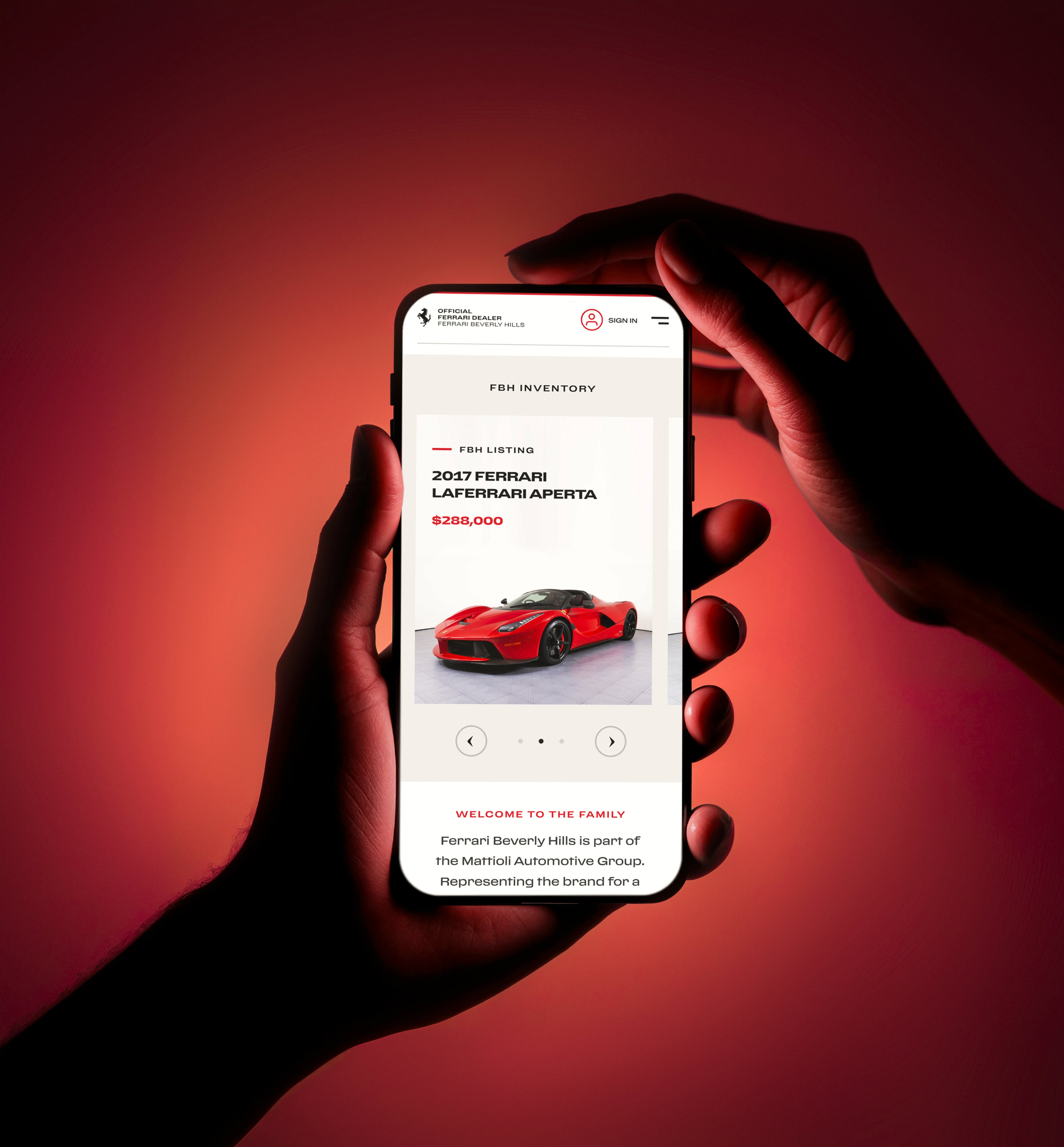
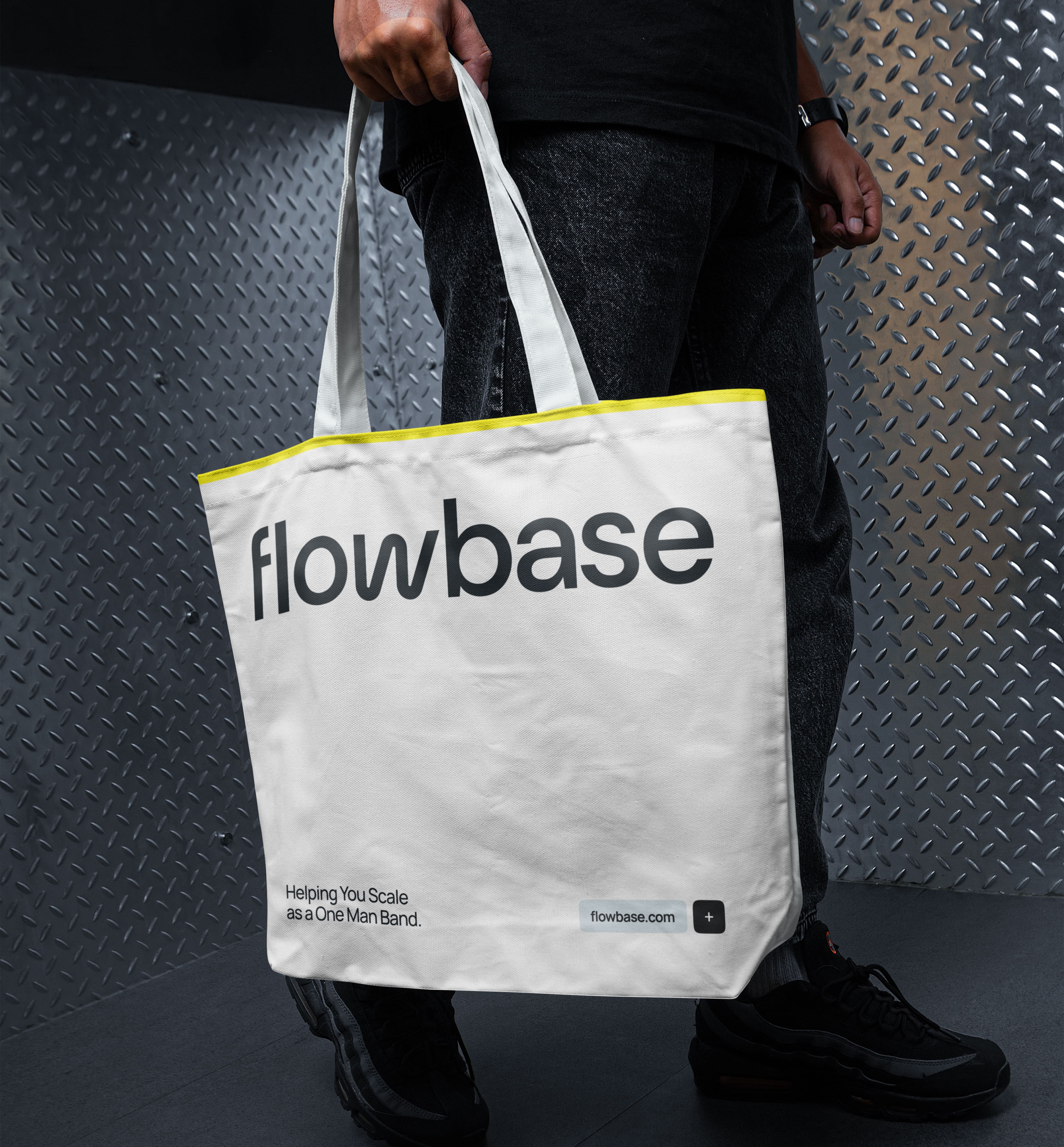
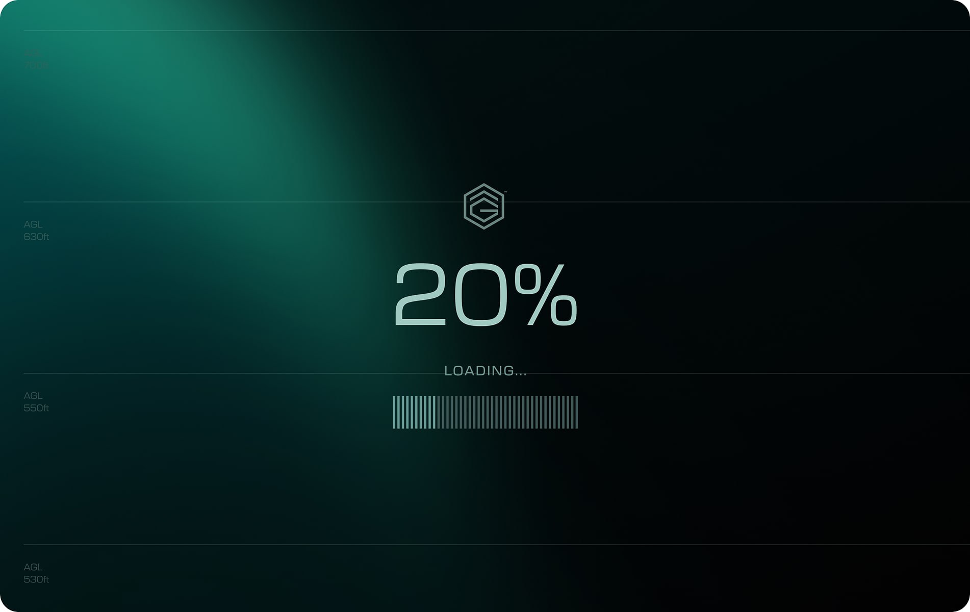
You don’t remember every page you’ve visited this week - but you do remember how that one app greeted you by name, how the “add to cart” button pulsed just before you clicked, or how the loading animation gave you a moment of delight instead of frustration.
These are microinteractions. And they’re doing more than you think.
At AKEO, we often talk about clarity, performance, and usability. But we also believe in joy - those small, often overlooked moments that shape how people feel about a product. Microinteractions are a critical part of this equation.
What are microinteractions (and why do they matter)?
Microinteractions are the tiny UX elements that respond to user actions. Think: a vibration when you toggle a switch, an animated heart when you like a post, or a progress bar that shows you how far you’ve come.
They're not the core functionality, but they support it. And more importantly, they humanize it.
Good microinteractions do three things:
- Provide feedback – confirming a user’s action worked.
- Guide interaction – helping users understand what’s possible.
- Enhance emotional connection – adding personality and delight.
They build trust, create rhythm, and eliminate friction. And in competitive digital environments, they can be the difference between a product that’s functional and one that’s unforgettable.
Examples you already know (and probably love)
- LinkedIn's "profile strength" meter
Encourages completion by gamifying progress with a friendly tone and subtle visuals. - Slack’s loading screen messages
Turns waiting into a brand moment, using copy that reflects the product’s playful tone. - Instagram's like animation
The double-tap heart isn’t just visual - it’s emotional reinforcement. It feels good to give love, and it feels better when it’s acknowledged instantly.
These aren’t accidents. They’re decisions made at the intersection of design, motion, and psychology.


Why we build microinteractions early in the process
Too often, microinteractions are seen as “polish” - something added at the end, if there’s time. At AKEO, we approach them differently. We treat microinteractions as functional elements with a job to do.
In wireframes, we note where feedback or transitions matter, we test not just flows but micro-moments. Because in real use, people rarely read instructions - but they always feel responses.
Microinteractions also allow for scalable delight. You can embed small moments of humanity into an interface without overhauling your system or adding unnecessary complexity.
The ROI of tiny UX choices
Great microinteractions don’t just feel good - they perform.
- Conversions: Subtle animations on CTAs can guide attention without shouting. Research from the Nielsen Norman Group shows that feedback cues reduce user hesitation, increasing task completion rates.
- Retention: Small affirmations create positive memory loops. According to Interaction Design Foundation, emotion-driven design improves brand perception and customer loyalty.
- Support costs: Clear feedback reduces user confusion and prevents unnecessary support requests.
How we think about microinteractions at AKEO
Whether we’re designing for fintech, Web3, or digital marketplaces, we follow the same principle: never miss an opportunity to make it feel better.
Microinteractions are often the only part of the UX a user actually remembers. The calm tap. The cheerful tick. The easing motion that says “you did it right.”
We believe that these are not aesthetic choices. They are design decisions with impact -on business, on brand, and on how people feel.

In an era where products compete on speed, scale, and functionality, it’s the quiet details that whisper quality. And people hear them. So yes, the magic is in the micro. And no, it’s not extra - it’s essential.





-min.jpg)
