


Web3 comes with big promises: decentralization, transparency, user ownership. But for designers, it also brings something more subtle - and more complex. A shift in mental models, interaction patterns, and trust dynamics.
At AKEO, we’ve been designing for Web3 long enough to know: this space is noisy, fast, and full of hype. But under the surface, it also demands some of the most thoughtful, user-centered design work we’ve ever done.
This post isn’t a manifesto. It’s a designer’s field guide. Here’s what’s actually different in Web3 UX - and what’s still just good design.

The architecture changed. The user didn’t.
In Web3, users interact with smart contracts, not just apps. They sign transactions, manage wallets, and handle private keys. But here’s the catch: most users don’t care.
They still want clarity, speed, and confidence. They don’t want to “learn the blockchain.” They want to know: Did this work? Is it safe? What happens next?
That means one thing: Web3 UX should feel familiar before it feels revolutionary. The architecture can change radically. The interface shouldn't.
Onboarding is the hardest part of web3 - and the most important to get right
Web2 onboarding is friction. Web3 onboarding is friction, trust, and technical education rolled into one.
- Do I need a wallet?
- What’s gas?
- Why is there a warning when I sign something?
- Can I undo this?
If you lose them here, you lose them for good.At AKEO, we focus on progressive onboarding:
- Delay account creation until it’s absolutely necessary.
- Explain wallet connections with visual metaphors, not just technical terms.
- Use soft language and guided walkthroughs for first-time actions.
- Always give users a clear way to back out safely.
What stays: the need for clarity and emotional safety.
What changes: you’re designing for a less forgiving environment.


Wallets are the new identity layer - but they’re not UX tools
Designers often assume wallets are “the login” and move on. In reality, wallets are complex user agents - and poor ones, in most cases.
They don’t:
- Remember UI context
- Offer great device handoff
- Explain risks during signing
They do:
- Hold real assets
- Confuse users with raw contract data
- Introduce irreversible flows
This means your product has to carry more of the UX responsibility.
That includes:
- Interpreting signing requests in plain language
- Building trust indicators (e.g., human-readable previews, visual signatures)
- Designing for failure (wallet not installed, wrong network, no balance)
You don’t get to skip UX just because the wallet handles the transaction.
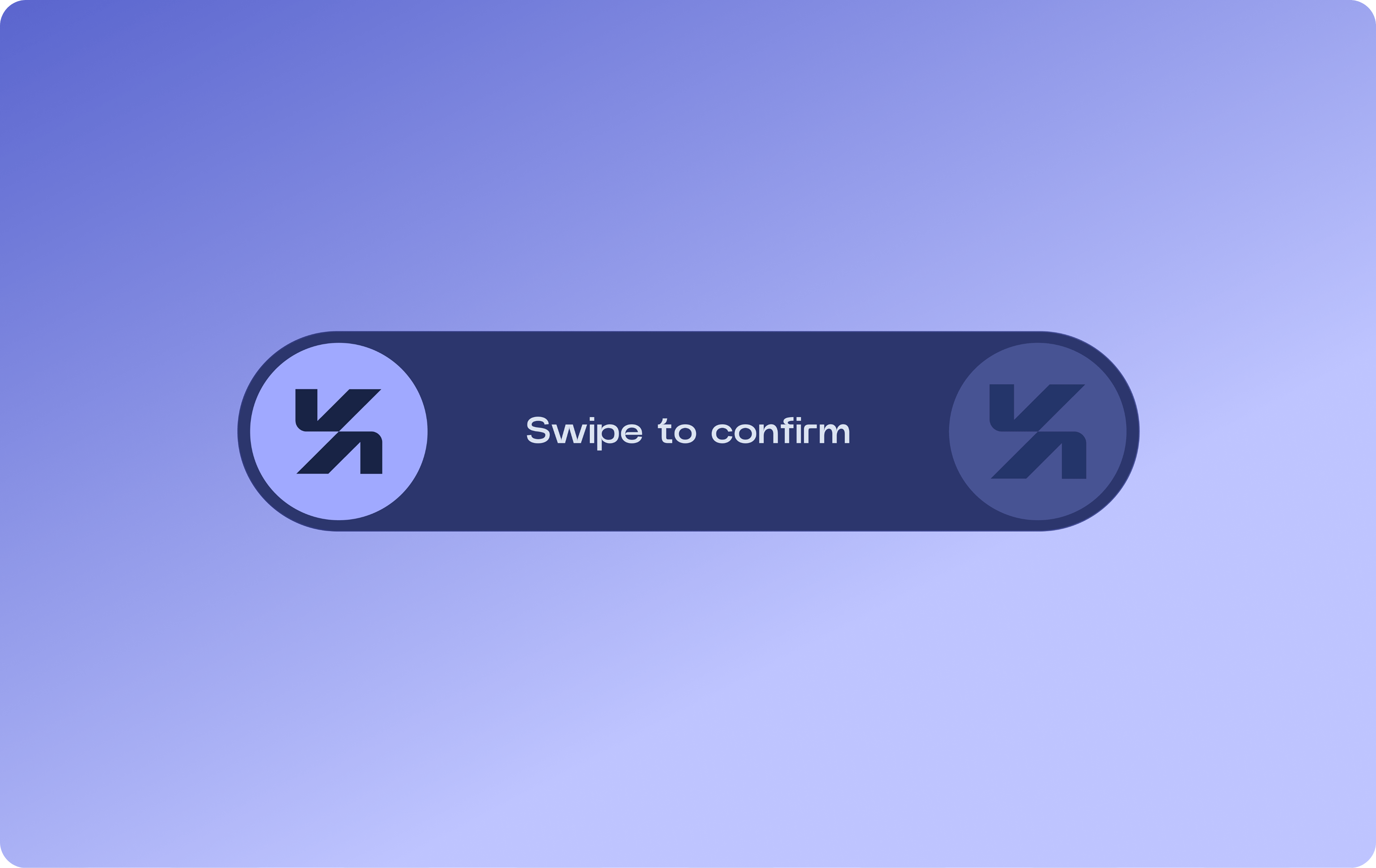
Errors matter more. So does feedback.
In Web3, a failed transaction isn’t just annoying - it can cost real money.
The importance of:
- Pre-checks (gas, balance, contract approval)
- Real-time feedback (pending, success, failed with reason)
- Redundancy: retries, manual fallback, QR alternatives
"Did it go through?" is the most anxious question in crypto UX. The fix?
Show intent → action → result as clearly and confidently as possible. Animate the flow.
Show hashes, not just spinners. Offer receipts users can save or share.
Feedback isn’t just UI polish in Web3. It’s security.
Design ethics are no longer optional
Many Web3 projects claim to decentralize power. But what does that look like in interface design?
- Are users aware of the risks when interacting with a smart contract?
- Can they tell if a DAO vote will cost gas?
- Is staking money or just UI language for locking it?
Design becomes ethical when users are dealing with irreversible, financial, or anonymous systems. Good Web3 design doesn't just delight - it informs and protects.
What stays: the responsibility to be transparent.
What changes: the stakes of getting it wrong.
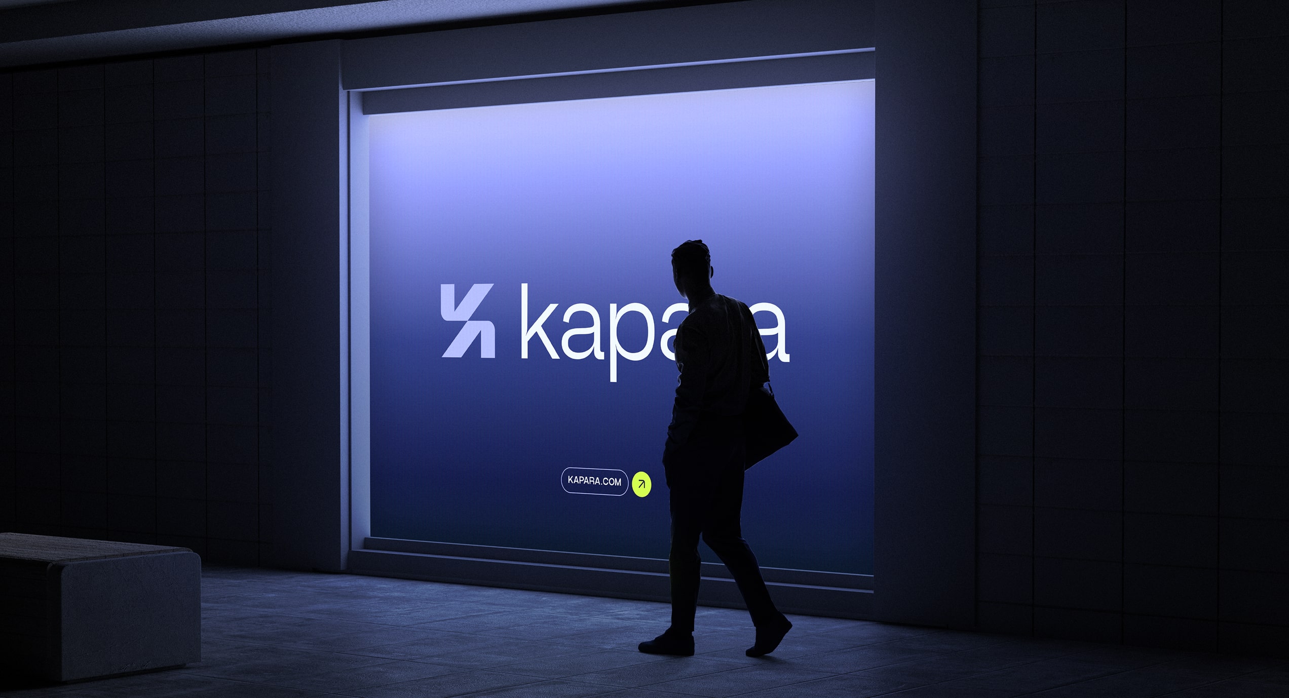
Branding and visual language still matter (more than ever)
Web3 products live in wallets, dashboards, and aggregator feeds. They’re often one tab among many, and they're competing for trust.
Clear hierarchy, strong brand presence, and consistent UI affordances go a long way. When people don’t know who to trust, they lean on visual credibility. That’s where design becomes product strategy.
In Web3, we design to signal quality before interaction happens. That means:
- Crisp UI
- Clear iconography
- Consistent motion language
- Legible contract details
- Memorable branding that isn’t derivative
Web3 is still young. It’s volatile, sometimes contradictory, and often full of products chasing innovation at the cost of usability. But the foundation of good design hasn’t changed. If anything, it’s become more urgent: clarity over complexity, trust over trends, guidance over novelty.We’re not here to reinvent everything.
We’re here to bring the best of UX into a new context - so the next generation of decentralized products is not only more powerful, but also more humane.